Spring 2016 is just around the corner, and with a new season comes a new color palatte. Get blown away by stunning coral and plum shades.
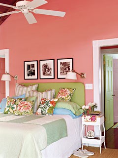
Coral
You’d be surprised how many rooms look absolutely stunning wrapped in a light shade of coral.
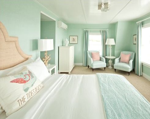
Mint
Find your sanctuary with a relaxing, revitalizing shade of mint.
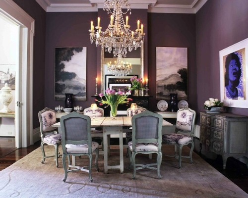
Plum
A light purple hue can make your space look effortlessly classy.
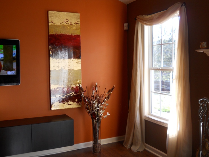
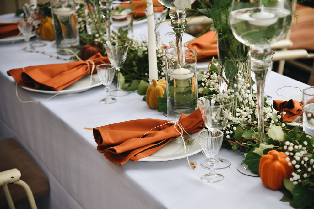
Copper
Add a flair of fiesta to a boring wall with a rich shade of copper.
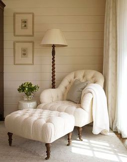
Ivory
If the commitment of a brighter color scares you, try a gorgeous ivory, it adds a subtle color to any room.
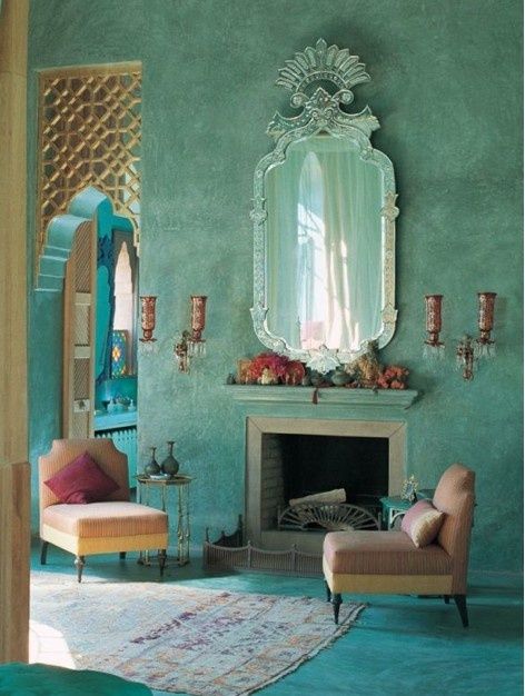
Turquoise
A gorgeously eclectic shade that is compliments easily with a set of throw pillows.
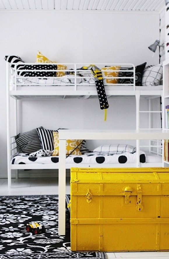
Yellow
If the thought of canary yellow walls scares you, you can always just use the color as an accent! You”ll love the brightness!
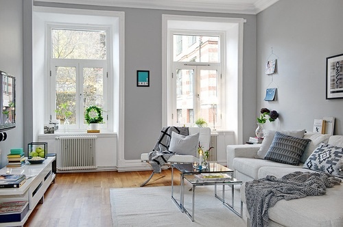
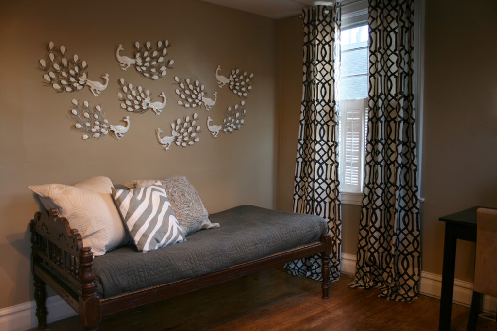
Grey
Choosing a light grey when painting is a great way to make a statement without actually having to commit to a louder hue.
Blue Vortex
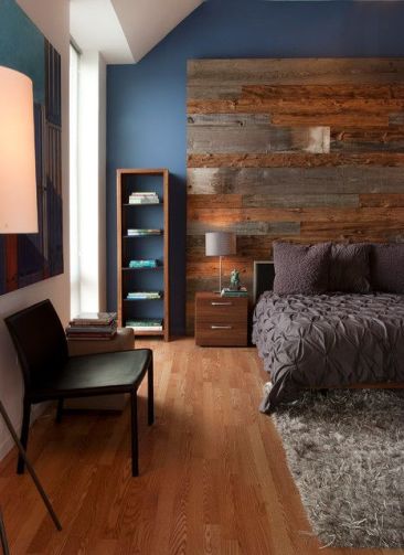
Add some purple to a classic navy color and you’ll end with the richest wall coloring.
Black
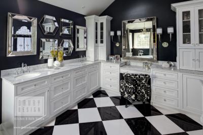
Glam up boring bathroom with a lovely pearl and black combination.
Olive
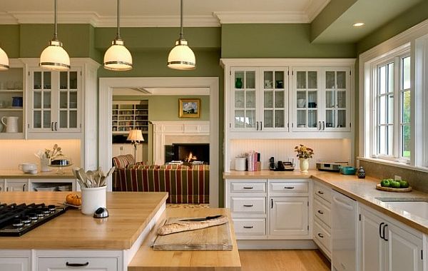
Nothing says “bon appetite” quite like olive colored walls.
Gold
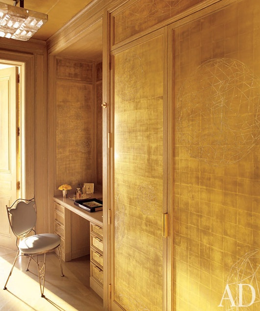
Paint with a reflective gold to bring a sense of high style to any room.
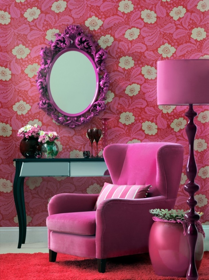
Pretty in Pink
Go for a luscious pink to decorate a sitting room or personal library. If the thought scares you, use accent colors instead of paint!
Coffee
If you’re a certified coffee addict, maybe it is time to take your love of coffee to the walls!



U living room and kitchen is separated by a bar the living room is rectangle shape and the kitchen square I would like to paint my living room a bright gold and add some bright silver in there somewhere and a few mirror to help make it look bigger and brighter but not sure how it would work I need help lol
What brand is the coffee color and name and/or number of the color?
What is the color of gray on these walls? Love it.
Aside from the neutrals and the ever-popular turquoise – no. Plum? No. Copper/orange? No. Black – of course, coffee – classic neutral, grey, classic neutral, yellow – probably not, ivory, I don’t think so, gold…probably not – I do like that particular icy mint, like a super light, ice blue – always a winner.”vortex” blue? No. Coral? I hate coral so not a good judge of whether or not it will fly – I would say no to the coral shown here. I would say neutrals but not neutralized colors. Olive – can be neutral if it’s done right but not as shown. For metals, I WOULD say copper and antiqued silver, otherwise, neutrals with jewel-tone accents. I think the innovation will be in wood. better natural looking “aged” finishes. And, of course, even more “made” stuff. Unique, one of a kind items with more artistic elements that could include just about any color. I would definitely say art – the standard oil/acrylic palette. Titanium white, ultramarine, cadmium red, burnt sienna and umber – like that. Art is going to boom even further – arts and crafts. Comfort and fun. And hopefully, they’ll get rid of those pout-y models. Happy, comfortable, fun and confident. Less appearance, more substance – less screenwriter, more playwright.
Gallon Freezer Bags-Also you can buy Quart Containers in bulk through a Culinary school sul,lierpapso easy open flour bins that can hold over 50lbs of flour/sugar.